Desk Lamp Photobiological Safety: Standards Explained
6th May•8 min read
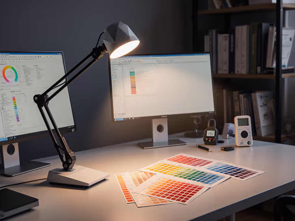
Desk lamp color accuracy determines whether you see true colors at your work surface, or a flattened, misleading version. For artists, photographers, designers, and anyone matching materials or colors on screen, spectrum quality isn't aesthetic preference; it's precision infrastructure. Yet most lamp specs hide the truth behind vague marketing and inflated numbers. For a deeper dive into these metrics, see our TM-30 and R9 guide. After returning three 'deal' lamps that either buzzed at dim settings or delivered washed-out color, I learned that a cheap lamp with honest CRI beats an expensive one with spec inflation every time.
You buy a desk lamp marketed as "high-CRI" or "daylight-accurate." The spec sheet says 95 CRI. You set it up, and colors still look off: reds appear muddy, skin tones shift as you dim, or the light feels harsh and artificial.
The culprit: CRI alone is incomplete. Manufacturers measure it under ideal lab conditions, often averaging only eight test colors. A lamp can score 95 on CRI while rendering critical reds and saturated colors terribly. For painters, fabric selectors, retouchers, and video creators, this gap between spec and reality becomes expensive quickly (time spent second-guessing, adjusting in post, or starting over).
Worse, dimming often changes color. As you turn down brightness, color temperature drifts, or the spectrum itself narrows, casting a greenish or magenta tint. A lamp that looked neutral at full brightness becomes unusable by evening.
You need a framework to decode what's real. The problem isn't the metrics, it's that they're rarely explained in terms that predict desk performance.
Lamps with the same CRI can look wildly different because CRI measures only eight discrete colors (pastel reds, yellows, greens, blues, skin tones, and three others). Two lamps scoring 90 CRI might render saturated reds (R9) at vastly different accuracy: one at 85, the other at 60. For artists, weak R9 is catastrophic.
Color also drifts across dimming ranges. A lamp might hold color temperature steady from 100% to 50%, then shift warmer or cooler below that. Inexpensive dimmers use low-frequency PWM (pulse-width modulation), which flickers and, for sensitive users, causes eye fatigue or headaches (defeating the purpose of a workspace upgrade). To understand why this happens, read our LED driver explainer covering PWM, constant current, and flicker testing.
Finally, spectral power distribution (the raw wavelength output) varies wildly. Two lamps with identical CRI and R9 may render cyan or magenta differently if their spectra are shaped differently. A "balanced" spectrum centered on natural daylight is rare and usually costs more.
Most buyers skip this research and trust a single metric or a coupon. Then they end up like I did: swapping lamps every few months because something felt off.
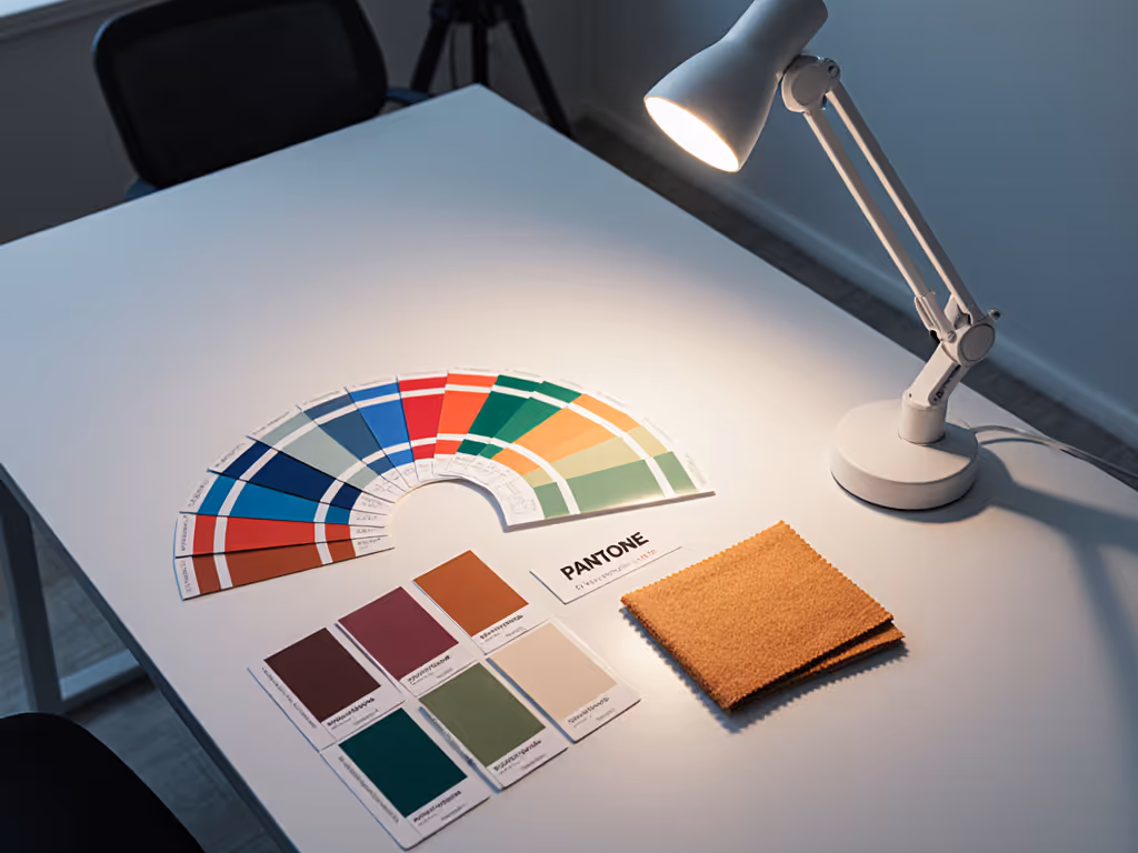
Start with CRI (Color Rendering Index). This measures how a light source reproduces a reference set of 14 colors compared to an ideal daylight or tungsten reference. A CRI of 80-89 suggests acceptable color rendering for general tasks; 90+ is needed for color-critical work.[1]
But CRI averages results. R9, specifically, tests red rendering (typically the weakest point in LED lamps). Because human eyes are highly sensitive to skin tones and earth tones (which are red-based), a weak R9 makes faces look dull on video calls and coral/burgundy shades appear washed out. Look for R9 of at least 85 for color work; 90+ is preferred.[1][2]
The newer TM-30 standard, developed by the Illuminating Engineering Society, evaluates 99 colors instead of 14, providing far more granular accuracy. It reports two metrics: Rf (fidelity to natural colors) and Rg (gamut, or saturation). Rf replaces CRI as the primary measure; Rg shows whether colors appear oversaturated or muted. A lamp with high Rf (90+) and Rg near 100 renders colors naturally and vividly.[1]
Spectral power distribution describes which wavelengths the lamp emits. A "full spectrum" lamp mimics daylight, peaking across red, green, and blue regions. Cheaper LEDs often have spiky spectra (sharp peaks in blue and yellow, weak in red) that can make warm tones look sickly and cause blue-heavy, fatiguing light, especially at night.
Here's a constraints-first checklist to test your lamp:
At Purchase or Review:
At Your Desk:
Not all color work demands the same standard.
Casual screen work and reading: CRI 80-85 suffices. Eye comfort matters more than color fidelity.[1]
Video calls, online meetings: Aim for CRI 90+, strong R9 (80+). Weak reds make faces look sallow and tired.
Photo editing and retouching: CRI 95+, R9 90+, ideally TM-30 data. You're making decisions that affect output quality.
Fine art, painting, model work: CRI 95+, R9 90+, full spectral data preferred. Weak reds in a painting lamp can shift an entire piece's mood.
Fabric, cosmetics, material matching: Highest bar: CRI 97+, R9 93+, stable across dimming. A 1-2 CRI-point error cascades into mismatches downstream.
A lamp's CRI means nothing if it shifts color when dimmed. Cheap PWM dimmers flicker (often at 100-1,000 Hz) and strain eyes. High-frequency PWM (20 kHz+) or true DC (analog) dimming avoids flicker and preserves color.[4]
Test by dimming to 20% and observing whether reds maintain saturation or shift toward magenta or green. Listen for coil whine or buzzing, signs of low-quality drivers. If a lamp sounds different at 30% than at full brightness, the driver is struggling, and that usually means color inconsistency too.
Value is lumen control, not coupons: right light, right task. A $60 lamp with honest CRI 92, R9 88, and flicker-free dimming will outperform a $200 lamp with a spec sheet that lies. The difference surfaces within a week: eye strain, color fatigue, and repeated adjustments tell you a lamp isn't working.
Actionable Summary:
The best desk lamp is the one that lets you work confidently, without second-guessing color, without eye fatigue, and without returning it three months in. Accurate spectrum is the foundation. Everything else (brightness, adjustability, aesthetics) builds on that. Pick the right metrics first.